Hannah Firmin


Hannah Firmin is an illustrator, expertised historical and decorative artist, own limited edition prints & artwork for exhibition and many more.
Here this artist uses great creativity in her work which i really like. I feel that using fruits, animals and other objects in her work really set off a formative look which jraws your attention however her designs dont really look modern which makes the images look boring. This artist uses deep and bold colours which i feel makes it stand out and also helps enlightens your mood a little.
The colours bold colours used i might consider in my own design because it really stands out and helps catch the eye.
http://www.illustrationweb.com/artists/HannahFirmin/gallery/0
Alex Broeckel

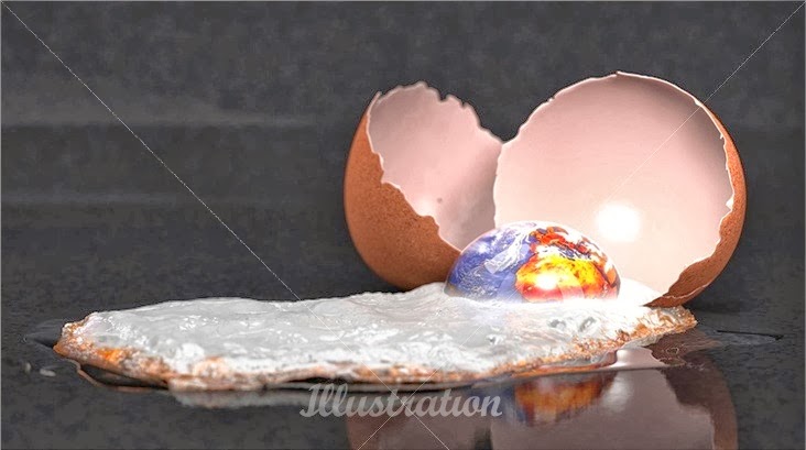

Alex Broeckel is a professional designer with a background of 12 years as a professional 3D Artist. He spent most of his time building and lighting digital environments for the entertainment industry. He worked as a Lighting Technial Director on famous movies like Harry Potter and the Prisoner of Azkaban & Roman Polanski’s Oliver Twist.
Here I like this artists type of work because of his unique creativity which really shows in his work. I feel that the digital creativity really stands out and makes you want to see more as his work really is outstanding and interesting. Creating things that are quite bizarre such as adding a tree with some land around a bottle really sets a great effect that goes really well together to create an amazing and rare piece of work.
Having creative images like this would go well on the advertisement posters as they will draw a lot of attention because of the uncommon media used.
Having creative images like this would go well on the advertisement posters as they will draw a lot of attention because of the uncommon media used.
Sam Bevington
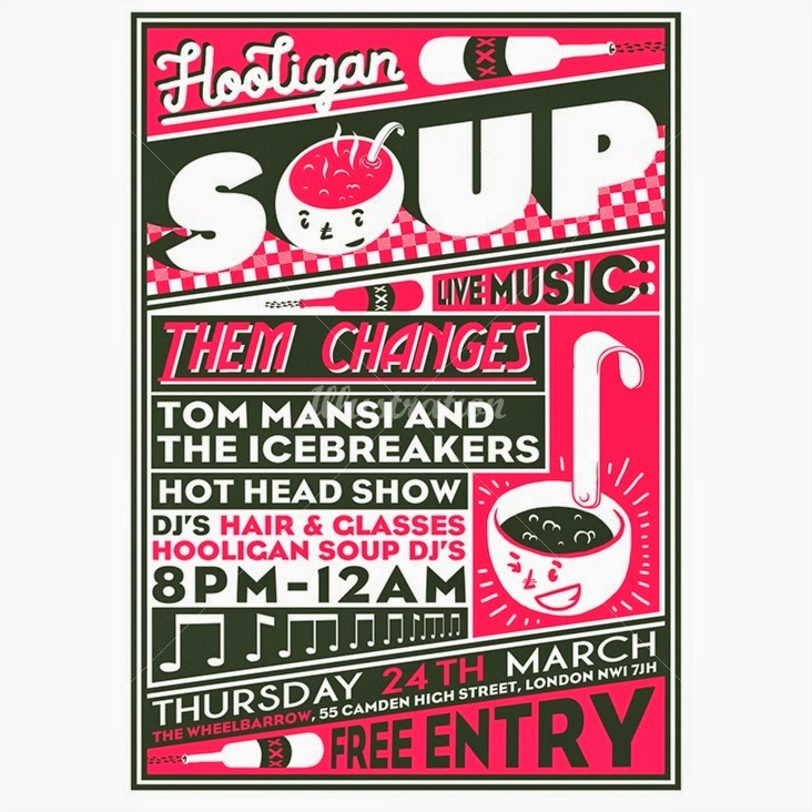


Sam Bevington is a London based Illustrator, Designer and sometime Animator
specialising in poster design and custom type.
specialising in poster design and custom type.
I quite like this artists work style because of the unique look he presents. I feel that the colours used are great as they are very bright and positive which is great as it catches your eye which then engages you to his work. I feel that putting his designs on newspaper is different but really looks superb because of the creative look it gives. The type used in most of this artists work is nice and bold which makes it easy to read, it is an extra feature that draws attention and also makes his work bounce out at you.
The type used is bold and thick which I may consider in my designs as this feature helps attract attention and also makes no problem when reading.
No comments:
Post a Comment